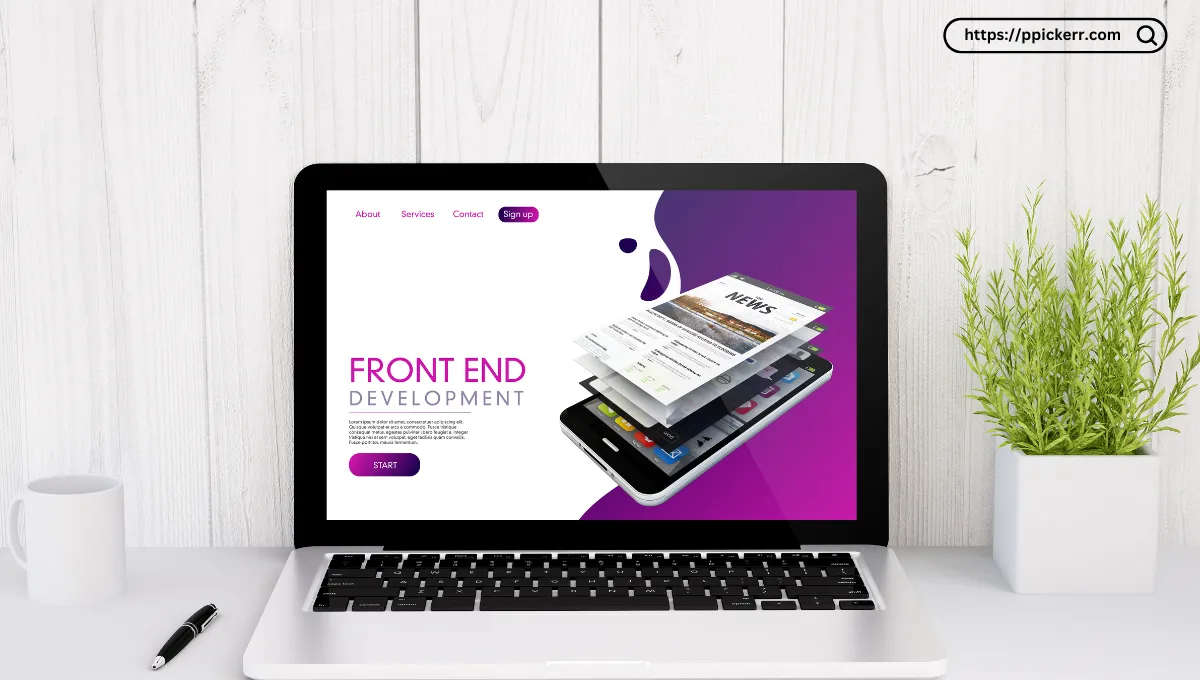
Have you ever visited a website and instantly felt calm, excited, or even overwhelmed? That’s the power of color psychology at work! Colors influence our emotions, decisions, and overall user experience. When used correctly in web design, they can improve engagement, boost conversions, and strengthen brand identity.
In this guide, we’ll explore how color psychology works, how to choose the right colors for your website, and real-life examples of brands using colors effectively.
Understanding Color Psychology
Color psychology is the study of how colors affect human behavior. Different colors evoke different emotions and can subconsciously influence users’ decisions.
Common Color Associations
| Color | Emotion/Meaning |
|---|---|
| Red | Passion, urgency, excitement, warning |
| Blue | Trust, calmness, professionalism |
| Green | Growth, health, nature, wealth |
| Yellow | Optimism, energy, happiness |
| Orange | Enthusiasm, creativity, friendliness |
| Black | Luxury, power, sophistication |
| White | Simplicity, cleanliness, purity |
| Purple | Royalty, wisdom, spirituality |
The Psychology Behind Color Choices
Red: The Color of Action
Red is often used for CTA (Call to Action) buttons because it grabs attention and creates a sense of urgency. Think of YouTube’s subscribe button or Coca-Cola’s branding.
Blue: Trust and Professionalism
Tech companies and financial institutions love blue because it conveys trust and reliability. Examples include Facebook, LinkedIn, and PayPal.
Green: Nature and Finance
Green is associated with growth and sustainability. Brands like Whole Foods and Starbucks use green to emphasize their eco-friendly and organic messaging.
Yellow: Optimism and Cheerfulness
McDonald’s uses yellow because it evokes happiness and appetite, encouraging people to stay longer and enjoy their meals.
How to Choose the Right Colors for Your Website
Selecting the right colors involves more than just personal preference. Consider the following factors:
1. Understand Your Brand Personality
Think about what your brand represents. Are you professional, fun, or luxurious? Your color choices should reflect your brand’s identity.
2. Know Your Target Audience
Different demographics react differently to colors. For example, studies show that men prefer blue and green, while women prefer purple and softer tones.
3. Use the 60-30-10 Rule
A balanced color scheme improves visual appeal. This rule suggests:
- 60% dominant color (background or primary branding)
- 30% secondary color (for contrast and visual interest)
- 10% accent color (used for CTAs and highlights)
4. Consider Cultural Differences
Colors have different meanings in various cultures. For example, red symbolizes luck in China but represents danger in Western cultures.
Best Practices for Implementing Color in Web Design
1. Use Contrasting Colors for Readability
High contrast between text and background enhances readability. Black text on a white background is the easiest to read.
2. Highlight CTAs with Bold Colors
Use striking colors like red, orange, or green for call-to-action buttons to increase conversions.
3. Stick to a Cohesive Color Palette
Too many colors can be overwhelming. Stick to three to five colors for consistency.
4. Test Your Colors with A/B Testing
Experiment with different color combinations to see which ones drive more engagement and conversions.
Real-Life Examples of Color Psychology in Action
1. Facebook (Blue)
Facebook uses blue because it builds trust and reliability. It’s also a calming color, making users spend more time on the platform.
2. Amazon (Orange & Yellow)
Amazon uses orange and yellow for its buy buttons, making them stand out and creating a sense of urgency.
3. Netflix (Red & Black)
Netflix’s combination of red and black evokes excitement and sophistication, making it ideal for an entertainment brand.
4. Apple (White & Gray)
Apple’s minimalist color palette reflects simplicity, elegance, and high-end appeal.
What is the best color for a CTA button?
Red, orange, and green are highly effective for CTA buttons as they stand out and encourage action.
How many colors should I use in web design?
Stick to three to five colors to maintain a clean and professional look.
Does color affect website conversions?
Yes! Studies show that color can increase brand recognition by 80% and influence purchase decisions.
What colors should I avoid in web design?
Avoid using colors with low contrast (e.g., yellow text on a white background), as they can make text hard to read.
How can I test if my color choices are effective?
Use A/B testing to compare different color schemes and measure engagement and conversion rates.
Conclusion
Color psychology plays a crucial role in web design, influencing user perception and behavior. By understanding color meanings and strategically implementing them in your design, you can create a website that resonates with your audience and drives conversions.
If you’re designing a website, take time to analyze your brand identity, target audience, and industry trends before finalizing your color scheme.


Leave a Reply